Understanding Bootstrap
How to style with Bootstrap and basic concepts

I am a Frontend developer
What is Bootstrap?
Bootstrap is a free-to-use open-source CSS framework focused on mobile and desktop front-end web development. Bootstrap contains HTML, CSS, and JavaScript (optionally) based design, and style samples for typography, forms, buttons, navigation, modals, tables, image carousels, icons, and other user interface(UI) components.
Here is an example of Bootstrap;
<div class="jumbotron text-center">
  <h1>My First Bootstrap Page</h1>
  <p>Resize this responsive page to see the effect!</p>
</div>

<div class="container">
  <div class="row">
    <div class="col-sm-4">
      <h3>Column 1</h3>
      <p>Lorem ipsum dolor..</p>
    </div>
    <div class="col-sm-4">
      <h3>Column 2</h3>
      <p>Lorem ipsum dolor..</p>
    </div>
    <div class="col-sm-4">
      <h3>Column 3</h3>
      <p>Lorem ipsum dolor..</p>
    </div>
  </div>
</div>
History of Bootstrap
Bootstrap which was initially known as Twitter Blueprint. Mark Otto and Jacob Thornton at Twitter developed it at Twitter as a framework to encourage consistency across internal tools. After a few months of developing this framework, other developers at Twitter began to contribute to the project as a part of the hackathon-style week for the Twitter development team.
On August 19, 2011, Twitter Blueprint was renamed to Bootstrap and released as an open-source project. Mark Otto, Jacob Thornton, a small group of Twitter developers, and a large community of contributors have continually maintained it.
Bootstrap Versions
Bootstrap 2
On January 31, 2012, Bootstrap 2 was released, which added built-in support for Glyphicons, several new components, as well as changes to many of the existing components. This version supports responsive web design, meaning the layout of web pages adjusts dynamically, taking into account the characteristics of the device used (whether desktop, tablet, or mobile phone).
Bootstrap 3
On August 19, 2013, Bootstrap 3, was released. It redesigned components to use a flat design and a mobile-first approach. Bootstrap 3 features a new plugin system with namespaced events. Bootstrap 3 dropped Internet Explorer 7 and Firefox 3.6 support, but there is an optional polyfill for these browsers.
Bootstrap 4
Otto announced Bootstrap 4 on October 29, 2014. The first alpha version of Bootstrap 4 was released on August 19, 2015. The first beta version was released on August 10, 2017. Otto suspended work on Bootstrap 3 on September 6, 2016, to free up time to work on Bootstrap 4. Bootstrap 4 was finalized on January 18, 2018.
Significant changes include:
Major rewrite of the code
Addition of Reboot, a collection of element-specific CSS changes in a single file, based on Normalize
CSS Flexible Box support
Adding navigation customization options
Adding responsive spacing and sizing utilities
Increasing global font size from 14px to 16px for enhanced readability
Dropping the panel, thumbnail, pager, and well components
Dropping the Glyphicons icon font
Huge number of utility classes
Improved form styling, buttons, drop-down menus, media objects and image classes
Bootstrap 4 supports the latest versions of Google Chrome, Firefox, Internet Explorer, Opera, and Safari (except on Windows). It additionally supports back to IE10 and the latest Firefox Extended Support Release (ESR).
Bootstrap 5 was officially released on 05 May 2021 with its latest version 5.3.2 released on 14 September 2023.
Some of the major changes include:
New off-canvas menu component
Removing dependence on jQuery in favor of vanilla JavaScript
Rewriting the grid to support responsive gutters and columns placed outside of rows
Dropping support for Internet Explorer[18]
Adding a custom set of SVG icons[19]
Adding CSS custom properties
Improved API
Enhanced grid system
Improved customizing docs
Updated forms
RTL support
Build in dark mode support
NB: Bootstrap 3 and Bootstrap 4 are still maintained by the team for critical bug fixes and documentation changes, and it is still perfectly safe to continue using them. Anyways, new features will not be added to them again.
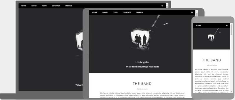
What is Responsive Web Design?
Responsive web design in development is all about building websites and applications that automatically adjust themselves to look awesome on all device sizes, from small mobile phones to tablets, and large desktop devices.
How to get Bootstrap
There are a couple of ways to get started using Bootstrap on your own project or website.
Download Bootstrap from the official website
Install through the package manager
Include Bootstrap from a CDN
Downloading Bootstrap
You can download and host Bootstrap yourself by visiting the official webpage getbootstrap.com, following through with the official documentation, and getting it downloaded on your local project.
Install via Package Manager
You can also use Bootstrap on your projects by installing Bootstrap’s source Sass and JavaScript files through npm, yarn, RubyGems, Composer, or Meteor. This method does not include the documentation or the full build scripts.
npm
Install Bootstrap in your Node.js-powered apps with the npm package:
$ npm install bootstrap@5.3.2
yarn
Install Bootstrap in your Node.js-powered apps with the yarn package:
$ yarn add bootstrap@5.3.2
RubyGems
Install Bootstrap in your Ruby apps using Bundler (recommended) and RubyGems by adding the following line to your Gemfile:
gem 'bootstrap', '~> 5.3.2'
Alternatively, if you’re not using Bundler, you can install the gem by running this command:
$ gem install bootstrap -v 5.3.2
Composer
You can also install and manage Bootstrap’s Sass and JavaScript using Composer:
composer require twbs/bootstrap:5.3.2
Include Bootstrap via CDN
If you don’t want to download and host Bootstrap yourself through the official website, you can include Bootstrap’s production-ready CSS and JavaScript through CDN (Content Delivery Network) without the need for any build steps.
Let’s see this in a practical setup:
- Create an index.html file in your project root. Include the <meta name=”viewport”> tag for proper responsive behavior on mobile devices.
<!doctype html>
<html lang="en">
  <head>
    <meta charset="utf-8">
    <meta name="viewport" content="width=device-width, initial-scale=1">
    <title>Bootstrap demo</title>
  </head>
  <body>
    <h1>Hello, world!</h1>
  </body>
</html>
- Include Bootstrap’s CSS and JS. Place the <link> tag in the <head> for our CSS, and the <script> tag for our JavaScript bundle (including Popper for positioning dropdowns, poppers, and tooltips) before the closing </body>.
<!doctype html>
<html lang="en">
  <head>
    <meta charset="utf-8">
    <meta name="viewport" content="width=device-width, initial-scale=1">
    <title>Bootstrap demo</title>
    <link href="https://cdn.jsdelivr.net/npm/bootstrap@5.3.2/dist/css/bootstrap.min.css" rel="stylesheet" integrity="sha384-T3c6CoIi6uLrA9TneNEoa7RxnatzjcDSCmG1MXxSR1GAsXEV/Dwwykc2MPK8M2HN" crossorigin="anonymous">
  </head>
  <body>
    <h1>Hello, world!</h1>
    <script src="https://cdn.jsdelivr.net/npm/bootstrap@5.3.2/dist/js/bootstrap.bundle.min.js" integrity="sha384-C6RzsynM9kWDrMNeT87bh95OGNyZPhcTNXj1NW7RuBCsyN/o0jlpcV8Qyq46cDfL" crossorigin="anonymous"></script>
  </body>
</html>
You can also include Popper and JS separately. If you don’t plan to use dropdowns, popovers, or tooltips, you can save kilobytes by not including Popper.
<script src="https://cdn.jsdelivr.net/npm/@popperjs/core@2.11.8/dist/umd/popper.min.js" integrity="sha384-I7E8VVD/ismYTF4hNIPjVp/Zjvgyol6VFvRkX/vR+Vc4jQkC+hVqc2pM8ODewa9r" crossorigin="anonymous"></script>
<script src="https://cdn.jsdelivr.net/npm/bootstrap@5.3.2/dist/js/bootstrap.min.js" integrity="sha384-BBtl+eGJRgqQAUMxJ7pMwbEyER4l1g+O15P+16Ep7Q9Q+zqX6gSbd85u4mG4QzX+" crossorigin="anonymous"></script>
- Hello, world! Open the page in your browser of choice to see your Bootstrapped page. Now you can start building with Bootstrap by creating and customizing your own layout, adding dozens of components, and utilizing Bootstrap to your advantage.
CDN links
For reference purposes, here are the official CDN links:
Description URL
CSS https://cdn.jsdelivr.net/npm/bootstrap@5.3.2/dist/css/bootstrap.min.css
JS https://cdn.jsdelivr.net/npm/bootstrap@5.3.2/dist/js/bootstrap.bundle.min.js
Conclusion
To learn more about Bootstrap and its core features, you can visit the official website getbootstrap.com. Read up the official docs from the Bootstrap team and gain a better and deeper understanding of the framework.
From a recent survey, as of May 2023, Bootstrap is the 17th most-starred project on GitHub, with over 165,000 stars. According to w3Techs, Bootstrap is used by 19.3% of all websites.
With this, you can now see that Bootstrap has a large community, which makes it easy to access information and help from its stream of communities.
Thanks for reading up to the very end and happy learning.


